CrowdStreet
Onboarding Design Solutions
Project Overview
CrowdStreet is a fintech platform connecting investors with commercial real estate crowdfunding options. When I was hired at CrowdStreet I was put in charge of investor experience. In order to be FINRA compliant there is a rigorous process investors must go through in order to use the platform. My job would be to increase conversion rate and decrease our Customer Effort Score (CES) by making a smooth onboarding and account creation process.
My Role
Product Strategy
User Research
Interaction
Prototyping
User Testing
Illustration/iconography
Company Ask
CrowdStreet wanted a smooth onboarding and account creation flow that would increase the conversion rate by having new users legally suitable by the time they try to invest.
Problems to solve:
To be FINRA compliant, there are many questions the user is required to answer
For the user to be approved to invest on the platform, their information must be verified which takes time
Some of these requirements are new, so there could be push-back from current users
If a user tries to invest without a suitable account, they will have to be redirected back to the account creation flow
Project constraints for the interface:
The user must be able to exit the onboarding flow and come back to it as needed while keeping full access to the app
The UI must be easy to navigate for users of all ages and abilities
The flow must encourage a user to continue without making them feel obligated to answer a certain way, which would not be legally compliant
Strategy and Goal
Strategy:
The strategy of this onboarding and account creation flow is to make it optional up front but encouraged. I want the user to feel like they have the control to look at the app’s investment opportunities and see the value of filling out all the necessary information. The purpose of collecting the information should be well communicated. Whatever the user enters should be saved, and no information should be entered twice. I want the user to fill out the required information because it’s the simplest option, not because they feel like they have to.
Goals for the flow:
Simple and guided
Encouraging but not pushy
Easy to come back to as needed
Research
Who is the user:
People between the ages of 40-85, all genders, employed or retired with a college education.
Competitive analysis:
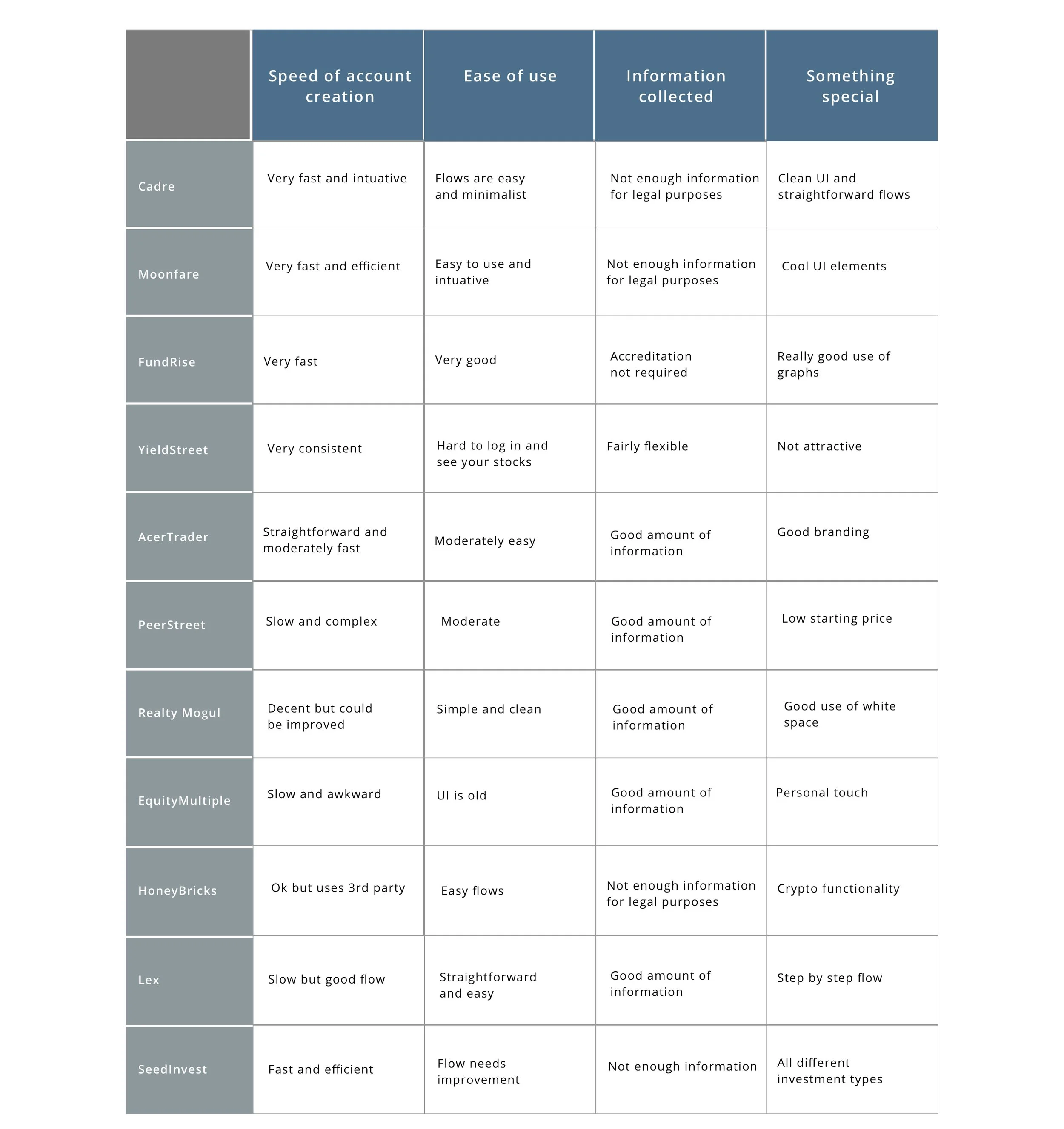
I compared onboarding, account creation, and investment flow for Cadre, Moonfare, FundRise, YieldStreet, AcerTrader, PeerStreet, Realty Mogul, EquityMultiple, HoneyBricks, Lex, and SeedInvest. I wanted to learn from the mistakes of others, and try to improve on their strengths.
User Interviews:
In order to make any changes on the platform it was very important that I understand the current users as well as the new users. I reached out to many users with different persona demographics and experience with the app. It became clear that users resented having to fill out so much information and were confused about why we were asking so many questions. They also struggled to navigate the profile and account setup process, and were unsure what was required of them.
Long forms vs step by step flow:
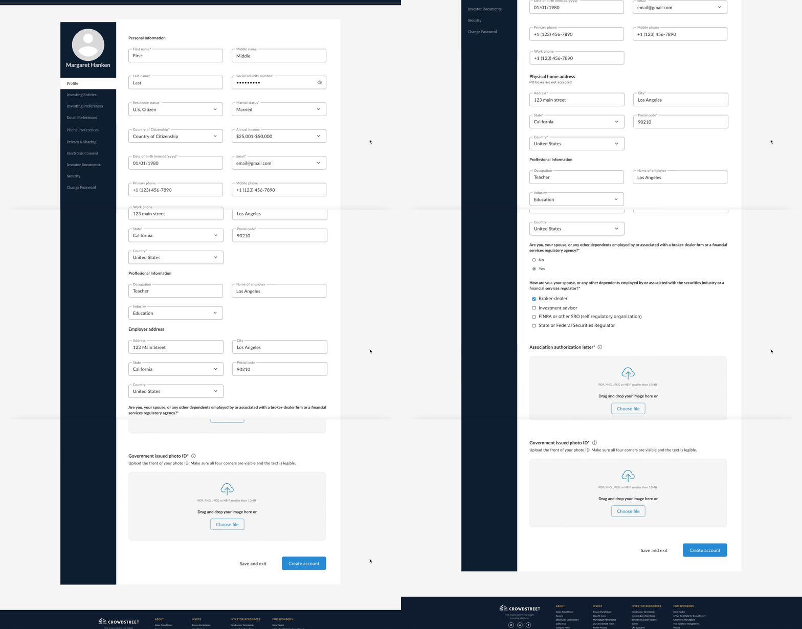
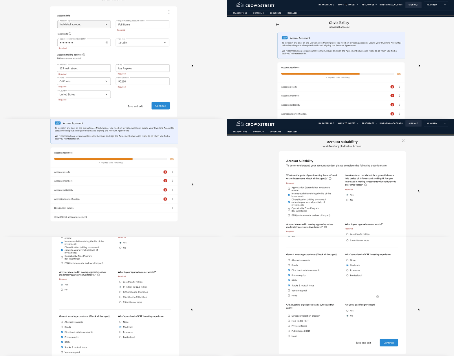
The legacy design of the app didn’t lead the user to create a profile. When the user did eventually find their way there they were greeted with the long form of inputs and questions you can see on the left.
Once a profile was created the user wasn’t prompted to create an account. The account creation process consisted of long forms to navigate through and the user was left to decipher the requirements.
Product Goals and Solutions
Goal #1:
Guide new investors to create their profile while providing the option to come back to it after the app’s value is demonstrated.
Solution:
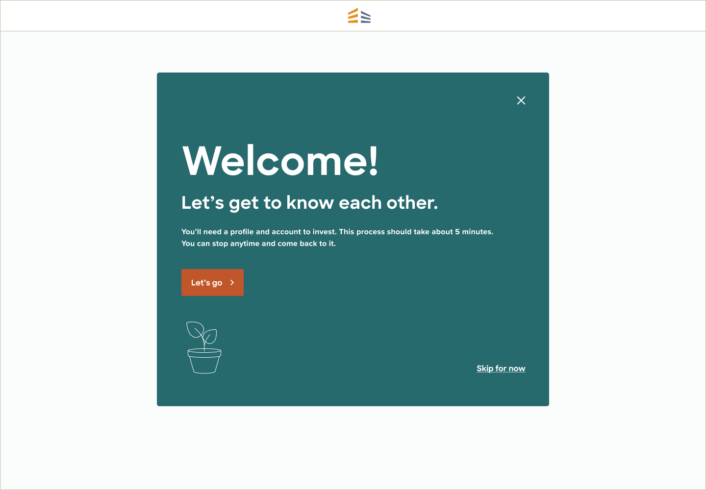
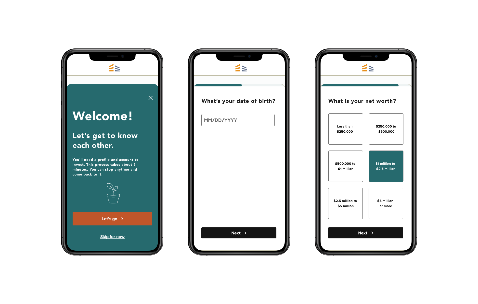
Immediately after signup, the user is lead into the profile creation flow with a subtle option to “skip”. The UI communicates to the user what to expect and what the options are, while encouraging them to continue with the profile creation flow.
Goal #2:
Reduce cognitive load
Solution:
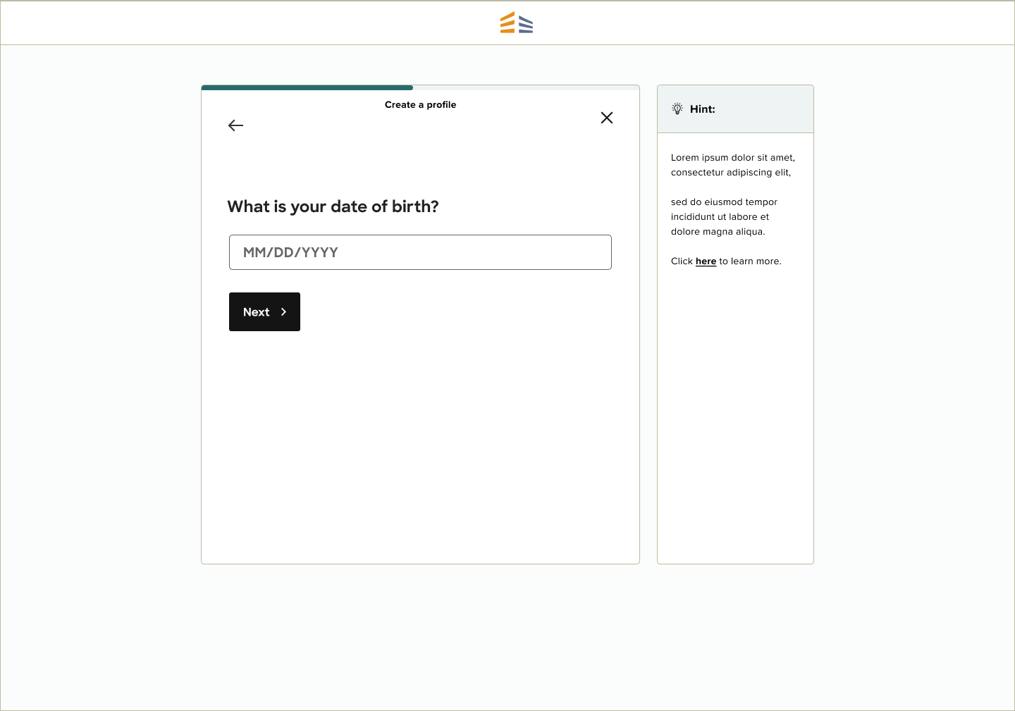
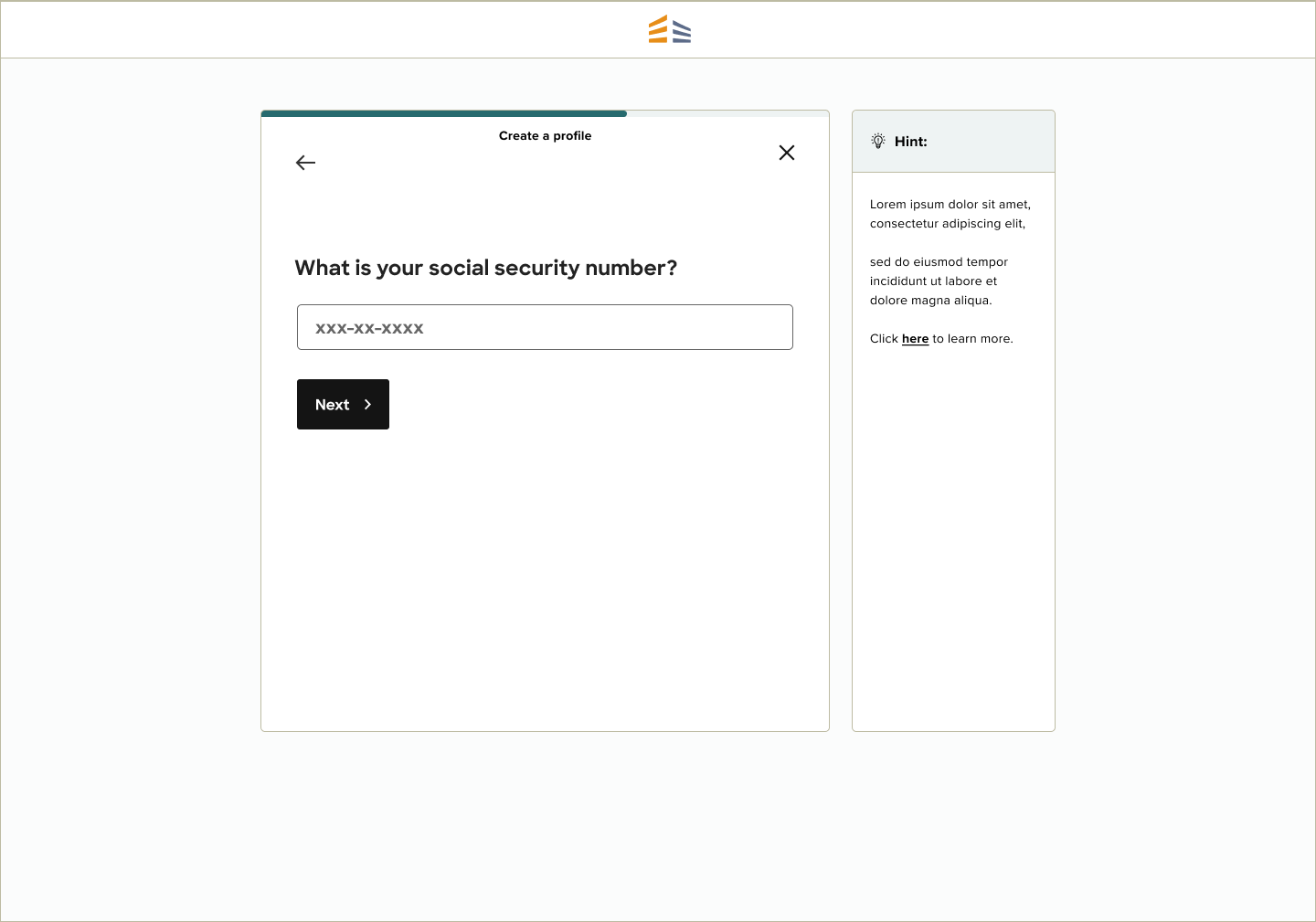
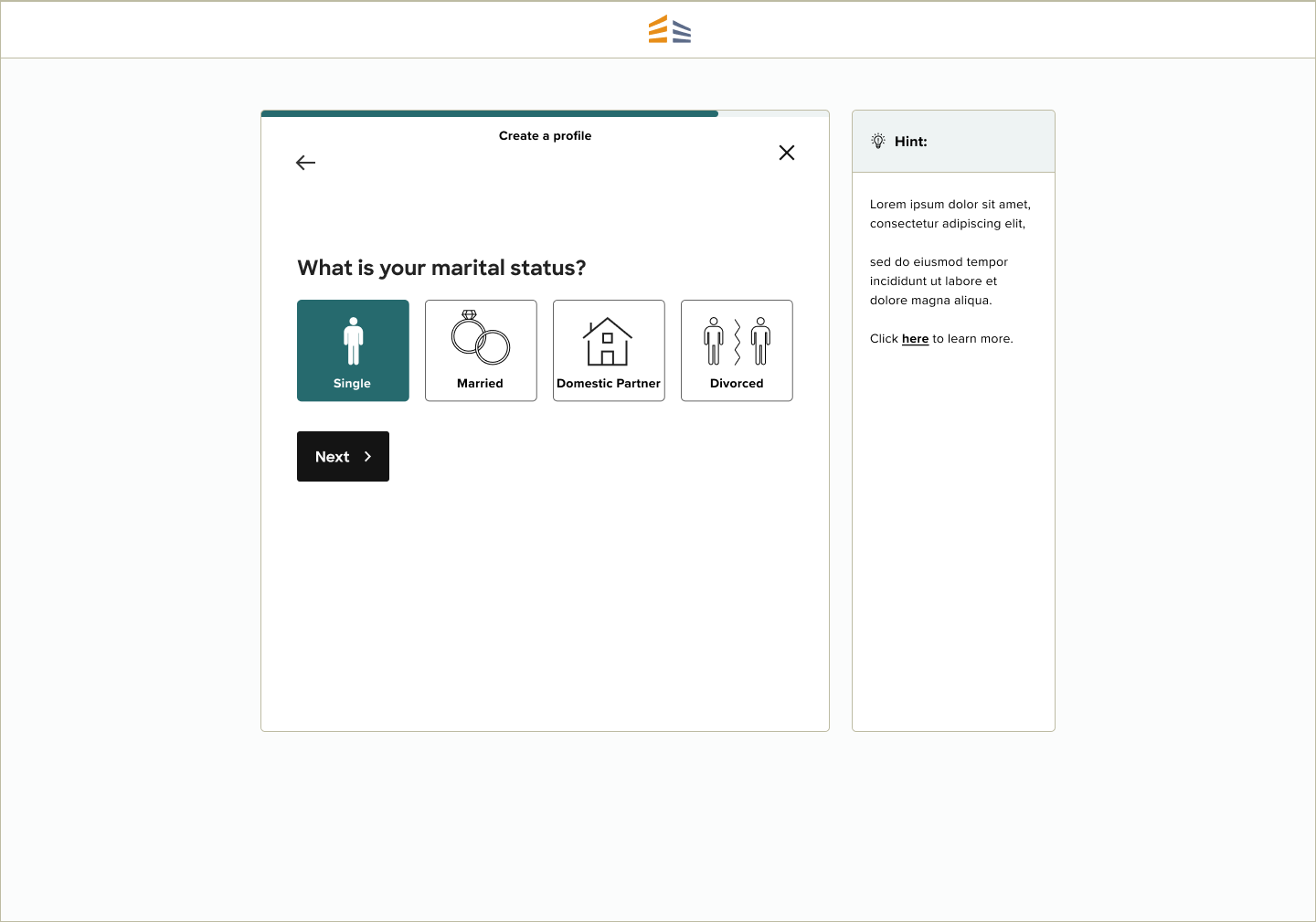
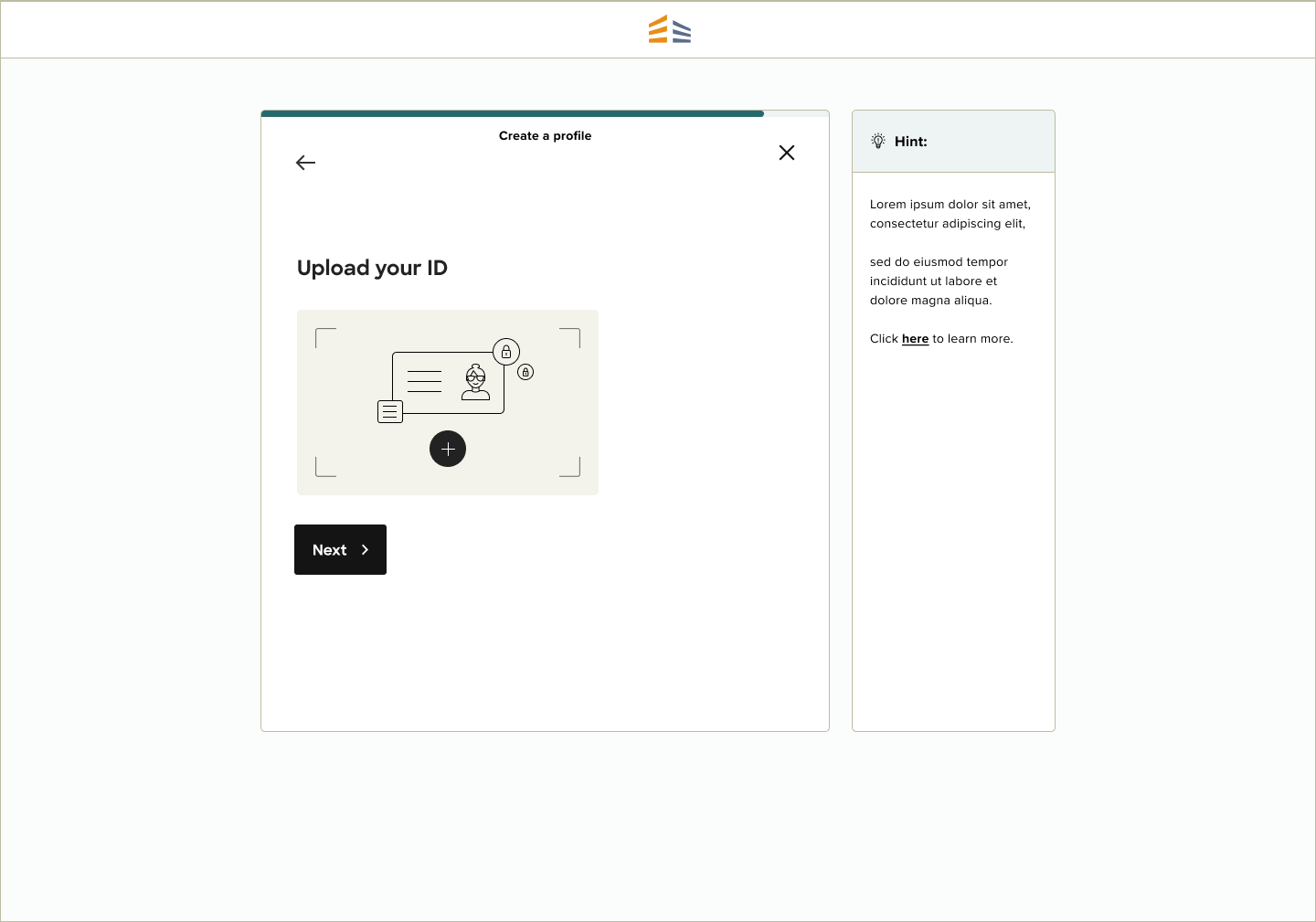
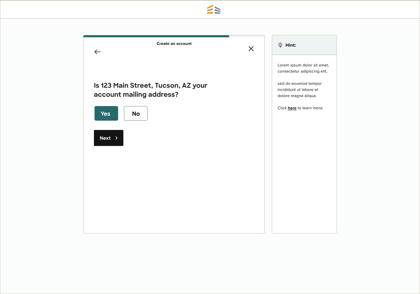
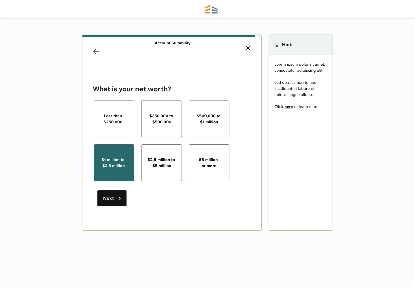
Instead of filling out long, daunting forms the user has to find, there is now a step-by-step flow the user is guided through. This way, the user only has to take on one task at a time with a very clear next step. This flow allows the user to complete a long form with relative ease.
Goal #3:
Reduce user effort
Solution:
The legacy onboarding design requires a lot of time and effort for new investors. It also required the user to fill out a lot of duplicate information. As well as clearly defining next steps and managing expectations, I wanted to limit typing as much as possible. Why can’t signing up for an investment platform be like taking a Buzzfeed quiz? Instead of asking the user to fill out their account address after filling out their profile address (yes, they can be different), the user can now click a button instead for typing it out again.
Goal #4:
Maintain a clean, simple interface with complicated legal requirements
Solution:
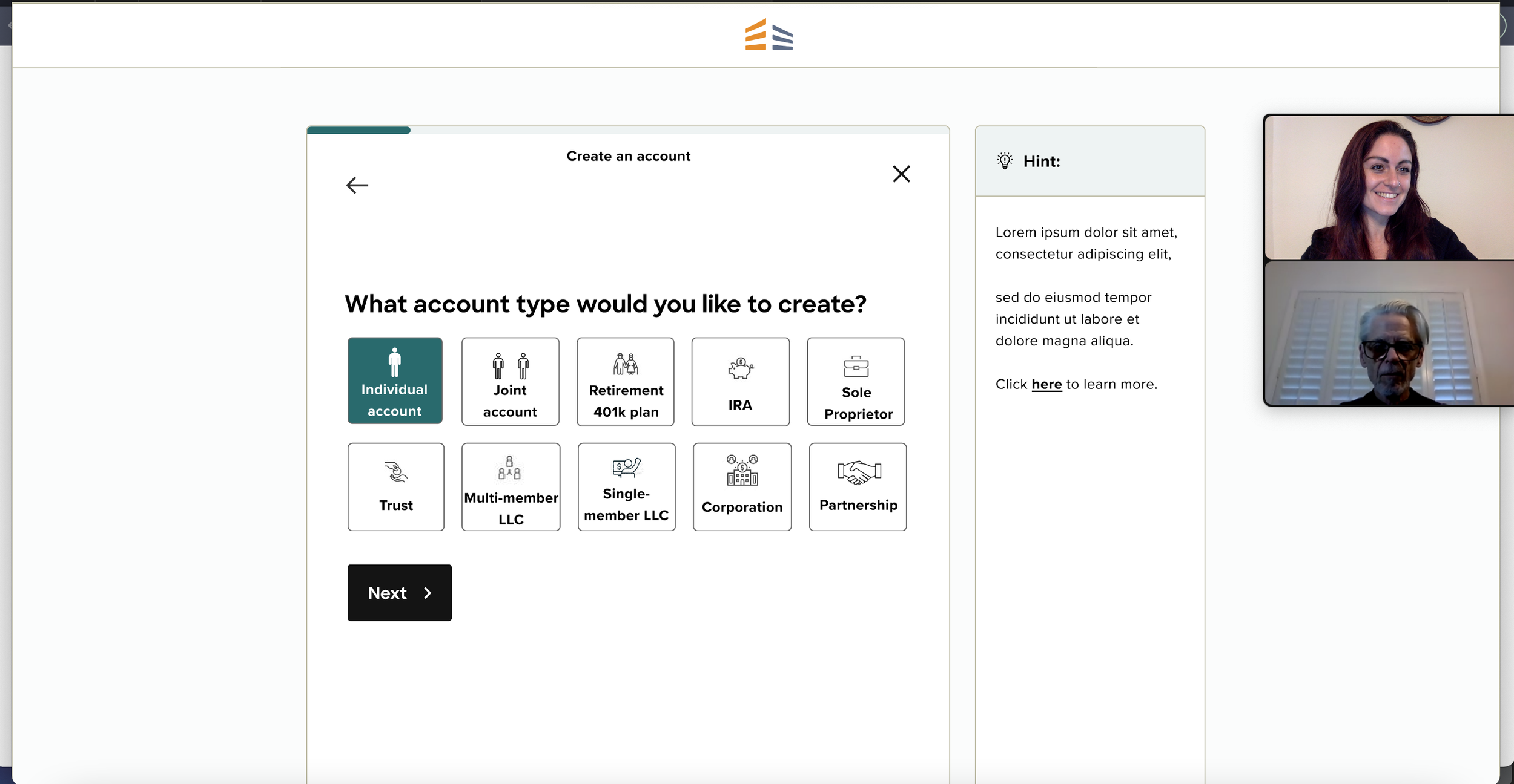
When seeing a page, our eyes scan from left to right, or left and down. I designed each page so that the user would first focus on only the question and CTA, then would focus on the help section on the right if they need further guidance. The help text is purposely off to the side to not bog down the page with text or overwhelm the user.
The New Profile and Account Creation Flow:


