Eventure
Designing an app that will take you places.
Project Overview
This mobile application is for promoting and attending events. Effortlessly find things to do near you, share them with friends, buy tickets, add the event to your calendar, get directions, and get push notification reminders of upcoming events. Users can filter events by category to get content catered to their interests. Easily search events, or find out what’s going on today, this weekend, or this month. This app will make planning out your activities easy by combining full functionality with a simple, usable interface.
My Role
User Research
Product Strategy
Visual Design
Interaction
Prototyping
User Testing
Client Ask
Design a native mobile application that has the ability to easily browse and filter events. The user will choose their city, or be located through GPS. The user should be able to filter by date and category, as well as search by keyword. There should be the ability to link to directions via Google Maps, and add the event to their Google Calendar. The user should be able to buy tickets through the app, as well as easily access them at time of use.
Problem to solve:
It’s hard to find, plan, organize, and remember events. Although it’s important to get out and explore, people are often too busy to attend all the events they would like.
Project constraints:
The user must be able to easily login through Google, filter by category and date, add event to Google calendar, and add friends and share events.
Strategy and Goal
Strategy:
The strategy of this mobile app is to create a user friendly, all-in-one design to help users find, remember, share and organize local events. This app will be easy and fun to use, and will have usability designed into every step of the process. The app will allow login through Google, browsing and filtering by personal preferences, buying tickets in the app, and event reminders. Our competitive advantage is our ability to use end-to-end functionality and good design to make the entire process intuitive for the user.
Goal:
The goal of this app is to make it easy and fun to get active in your community. We want to make planning and organizing effortless for our users, while also promoting artists and small businesses by matching the interests of users to upcoming events.

The User Centered Design Process
During this process I followed the 5 steps of design thinking to better understand the needs of the users and perfect the design with those needs in mind.
Empathize - Through interviews and competitive analysis I collected information on what people want, what is already available, and what the pain points of those applications are. This step helped me understand the problem I was trying to solve.
Define - After conducting the research, I analyzed the data collected, and started to define the needs of the project.
Ideate - The next step was to solve the problem. This brainstorming process helped me think outside the box to come up with creative ways to delight users.
Prototype - The next stage of the process was to start designing. I created sketches, wireframes, mockups, and finally animated prototypes to show potential users.
Test - By letting users interact with a fully functional prototype, I was able to get accurate, detailed feedback on what people liked and what needed to be changed. With this information I was able to adjust the design, and have it tested again. I continued this process until I had a design that the testers loved using.
Research
Who is the user:
The target users are adults in the US, age 18-55, employed, all genders, living in a middle-size to large city.
Interviews and competitive analysis:
While doing research for this project, I performed a competitive analysis on similar products. I started with interviews. I wanted to know what people are using and what they think of the apps that are available. The top used products that were similar to the project were Eventbrite, Local, All Events, Nearify, ActivTouch, and Agenda Panda. The competitive analysis was based on the following heuristics: good and bad features, user reviews, design, and ease of use. By doing this research I was able to identify qualities that were important for the usability of the app.
The Findings
The next step was to interpret the research into data, and apply the findings to the app. One thing I found was that users wanted the app to take care of the whole process. They wanted an all-in-one platform where they could find events, buy tickets, and coordinate with friends. Another finding was that wait times are very important. Users tended to give up on apps that took more than two seconds to load. From doing this research, I found that users were more likely to use an app that had a fun, casual layout. They wanted an app that has a lot of features, but also one that they feel comfortable using. A feature that users found important was syncing to other apps. For example, people wanted their events automatically added to their calendars without having to manually add them. Users wanted to feel like the apps understood their preferences. They didn’t want to spend a lot of time scrolling through events. They wanted their interests displayed front and center. However, users also wanted to be encouraged to try new things by seeing events outside their usual interests. According to the findings, people were less likely to use an app that requires a lot of reading or clicking. Users wanted the necessary information up front and visible.
Hypothesis:
People want more activities to fill their free time and they want to try more things. However, it takes time and energy to plan and coordinate with friends. If users were given an easy, fun way to plan and attend events, they would do more activities, and find their free time more fulfilling.
Personas
I used personas to help understand potential users based on the research. By creating these user types, I could examine behaviors, experiences, needs, desires, and goals. Once I had a better understanding of the users, I had a better idea of how I could design Eventure to solve their problems. I also used the personas I created as a base for further mapping methods.
Maps
Empathy Maps
I used empathy maps to understand the mindset of the users as they try out the first iteration of the design. I chose to make these maps for the user groups with key differences, so that I could understand the needs and desires of a range of lifestyles.
User Journey Maps
User journey maps are important for understanding a user’s process to find a product. I wanted to make sure that users were finding the product, and that they would keep using it once they had tried it. Often users have many choices of products and first time user experience is critical for an app’s success.
Prioritization Matrix
Now that I knew more about the potential users, I could decide which features to include. I used a prioritization matrix to narrow down what is most important, and what would take the least effort. Any features with a high amount of effort and low user value wouldn’t be included in this iteration.
Defining the MVP
The next step was to map out the features and decide the minimum viable product (MVP). My goal was to identify the minimum features that would create a fully functioning, testable product. This pyramid diagram is a good visual diagram of what features should be included in an initial release. I wanted to make sure that the app not only has functional features, but was also a usable, well rounded product.
User Flows, Use Cases, User Journeys
Now that I knew what features would be included, I could identify user end goals and map out how they would achieve those goals. This diagram shows the path users would take to log in or sign up with email and password. I find it helpful to picture the user’s path to complete tasks in order to streamline those processes.
Sketches and Wireframes
I always start my designs on paper. After I have sketched out a design I want to pursue, I create a wireframe. Wireframes are great for making designs more structured and concrete. I also use wireframes to get initial design feedback from stakeholders. This way they can see structure and flow without getting distracted with design elements like colors or photos.
Prototype
Once all the designs are mocked up, I create a click through prototype for testing. The prototype allows users to interact with the app and give more accurate feedback.
Testing
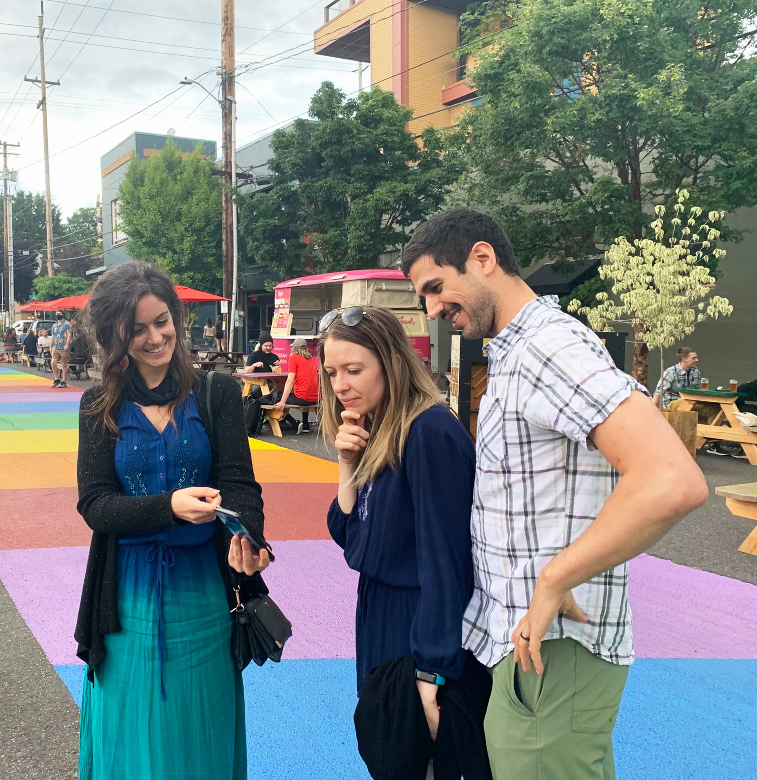
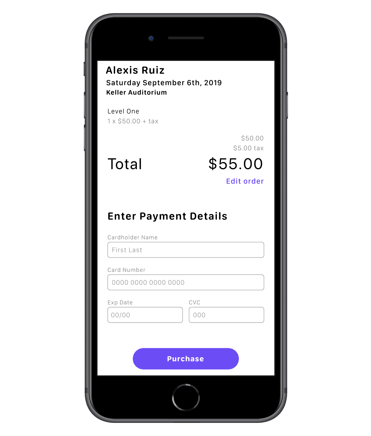
After the first prototypes were complete, I started the user testing process. While defining the MVP, I decided that we could add in-app ticket purchasing at a later release. However, the users testing the product said it was a major drawback, and could potentially draw them towards a competitor. I decided it was worth it to add the feature before the product launch in order to assure positive first time user experience. So, I added the simple flow you see below. I made it straight forward and satisfying to encourage future purchasing.
On the next round of tests, users took longer than expected to pull the tickets back up after they exited the page. If you’re in line to get into an event, the last thing you want is to have trouble finding the ticket. So, I added a ticket icon to the bottom bar. This links them to the My Tickets page, which sorts the tickets by date of event. Now the user can open the app and have their ticket up in two easy clicks.
Final Product
Go ahead and click through!


